The Ultimate Guide to the Bright Winter Color Palette

Content
Jump to section:
Last updated January 2025
Section 1: Bright Winter and the 12 Color Seasons
Bright Winter is one of the three winter seasons within the 12 Color Seasons in seasonal color analysis, a system that identifies the best colors to enhance your natural features.
Bright Winter sits between Bright Spring and True Winter, embodying the crisp coolness of winter while maintaining a bold, high-contrast vibrancy. It’s characterized by:

Bright Winter leans cool, with a foundation of icy and jewel-like hues. These cool undertones enhance the clarity of the complexion and ensure the colors feel crisp and vibrant. However, it can also incorporate certain slightly warmer tones, like bright cherry reds or clear turquoise, as long as they are bold and clean, rather than muted or earthy.
2. Bright, Vivid Colors

The defining characteristic of Bright Winter is its striking vibrancy and clarity. Unlike deep or muted palettes, this season thrives on bold, saturated shades that feel electric and energizing. Think of icy fuchsia, cobalt blue, lemon yellow, and emerald green—colors that pop with intensity while maintaining a cool, crisp quality.
3. High Intensity

Bright Winter colors embrace boldness and drama, staying in a bright and clear range. This high intensity creates a dazzling, luminous effect, making the palette perfect for showcasing the natural sharpness and brilliance of your appearance.
Section 2: The Bright Winter Color Palette
By focusing on the right shades and embracing clear, vibrant contrasts, Bright Winters can create a look that feels bold, radiant, and true to their dynamic essence. Bright Winter characteristics include a harmonious blend of high-energy, cool, and luminous colors, often inspired by celebrities and style icons who embody this striking aesthetic.
1. Core Colors
The core colors of the Bright Winter palette are inspired by nature’s icy and jewel-like tones, offering a blend of clarity and intensity. These shades enhance the natural brightness of this season without feeling harsh.
- Icy Fuchsia: A bright, cool fuchsia that exudes energy and brilliance.
- Cobalt Blue: A radiant, saturated blue that adds a refreshing vibrancy.
- Lemon Yellow: A bold, cool yellow that radiates crisp vitality.
- Emerald Green: A striking green with a cool edge, perfect for making a statement.
- Bright Red: A vivid, true red ideal for adding a dramatic, eye-catching element.

(for a complete guide with 80+ FHI Pantone colors click here)
2. Neutrals Colours
The Bright Winter color palette’s neutrals provide the perfect grounding for its vibrant shades, maintaining a clear, cool harmony.
These shades embody the crisp, frosty quality of the season:
- Cool White: A bright, clean white that pairs effortlessly with Bright Winter’s bold tones.
- Icy Gray: A light, cool gray that provides balance and softness.
- Silver: A shimmering metallic that adds depth and elegance.
- Cool Charcoal: A neutral dark gray with a cool undertone, ideal for subtle contrast.

3. Avoiding the Wrong Colors
To keep the Bright Winter palette cohesive, it’s essential to avoid colors that clash with its vibrant and cool nature:
- Muted or Dusty Colors: Shades like taupe, dusty rose, or muted greens lack the clarity and energy of Bright Winter.
- Warm, Earthy Colors: Tones like olive, camel, or warm browns feel too heavy and contrast poorly with Bright Winter’s cool undertones.
- Soft, Pastel Colors: Pale, muted pastels like baby pink or powder blue can dilute the boldness of the palette.
- Dark, Warm Colors: Shades like deep burgundy or warm chocolate brown feel overly heavy and out of place in the Bright Winter spectrum.

Instead, focus on crisp contrasts and saturated colors that reflect Bright Winter’s lively harmony. By choosing the right shades, Bright Winters can highlight their natural brilliance and captivating energy with effortless style.
Section 3: How to Identify Bright Winter Features
Bright Winter individuals share certain characteristics that can guide you toward identifying your season.
Skin Tone
Typically cool or neutral with a radiant and crisp quality. Bright Winter skin often has a porcelain, cool beige, or light olive undertone, exuding clarity and brightness. Unlike warm or muted tones, Bright Winter skin glows when paired with clear, saturated colors. To identify your undertone, check the veins on your wrist—blue or blue-purple veins often indicate a cool undertone.

Eye Color: Bright Winter eyes are vivid and striking, often in shades like icy blue, bright cobalt, clear green, or piercing gray. These eye colors are sharp and vibrant, harmonizing beautifully with the bold, saturated colors of the Bright Winter palette.
[Coming Soon]
Natural Hair Color: Hair is typically cool-toned, ranging from ash blonde to deep cool brown or black. It often has a naturally glossy and sharp appearance, with ashy or silver undertones that enhance the clarity of Bright Winter features.
[Coming Soon]
Understanding these Bright Winter characteristics can help you identify your season and make bold, confident style choices.
DIY Assessment: Testing Your Colors at Home
If you’re unsure of your season, you can perform a simple test to see how Bright Winter colors work with your natural features:
1. Gather Clothing or Fabric Swatches Collect fabrics in clear, vibrant shades like icy fuchsia, lemon yellow, cobalt blue, and emerald green. Include contrasting colors like beige, dusty rose, or camel for comparison.
2. Natural Lighting Stand in front of a mirror in natural daylight without makeup, as artificial lighting can distort color perception.
3. Drape Colors Hold each fabric close to your face and observe how it interacts with your features. Bright Winter colors should enhance your skin’s radiance, brighten your eyes, and bring overall harmony.
4. Compare Results Notice how bold, cool tones bring out your natural glow compared to warmer, muted, or overly earthy shades, which may dull your complexion or emphasize shadows.
Section 4: Bright Winter Patterns and Prints
Bright Winter’s vibrant and clear palette lends itself beautifully to bold, high-contrast patterns and prints. Here are some guidelines on how to make patterns work for you and what to avoid.
Choosing the Right Patterns
When selecting patterns, prioritize those that reflect the brightness and coolness of the Bright Winter palette:
1. Bright, Cool Colors
Opt for patterns featuring vivid shades like icy fuchsia, cobalt blue, lemon yellow, and emerald green. Avoid overly muted, warm, or earthy tones that clash with the clarity of the Bright Winter aesthetic.
2. High Contrast
Bright Winter thrives on bold contrast, so choose patterns with sharp distinctions between colors, such as white and black or bright blue and icy silver. Avoid low-contrast, blended designs that feel soft or muted.
3. Crisp, Dynamic Shapes
Geometric prints, sharp-edged florals, and abstract designs with defined lines complement Bright Winter’s crisp energy. Avoid overly delicate or blurry patterns that lack vibrancy and impact.
[coming soon]
Prints That Elevate Bright Winter
Certain prints naturally align with the Bright Winter aesthetic:
- Bold Florals: Choose medium to large florals with high-contrast, cool colors. They emphasize the drama and clarity of Bright Winter.
- Stripes and Checks: Crisp stripes or checks in cool, bold tones like white and cobalt blue or lemon yellow and black are flattering.
- Abstract Prints: Dynamic, high-energy patterns in clear, cool shades work well, such as graphic brushstroke designs or modern, colorful motifs.
- Polka Dots: High-contrast dots in cool, vibrant combinations like white and emerald green or black and fuchsia add playful sophistication.
By embracing patterns that reflect the sharpness and brightness of Bright Winter, you can create harmonious and striking looks that enhance your natural beauty.
Patterns to Avoid
To maintain harmony with the Bright Winter palette, avoid:
- Muted or Dusty Colors: Patterns with taupes, grays, or muted pastels lack the vibrancy needed for Bright Winter.
- Warm or Earthy Tones: Khakis, camel, or warm browns can feel heavy and out of place in the Bright Winter palette.
- Low-Contrast Designs: Faded or blended patterns that lack clear definition will appear flat and uninspired.
- Overly Soft or Romantic Styles: Watercolor florals or overly intricate designs can feel at odds with Bright Winter’s sharp energy.
By choosing patterns that embrace the vibrancy, clarity, and coolness of Bright Winter, you can create dynamic, head-turning looks that perfectly complement your natural features.
Section 5: Bright Winter Makeup Colors
Here’s how to enhance your features with makeup that complements Bright Winter’s vibrant and high-contrast palette.
Foundation and Base Makeup
Achieving a clear, luminous complexion is key for Bright Winters. The goal is to create a radiant, polished base that supports your bold and crisp features.
Foundation Tips: Choose a foundation with cool or neutral undertones to match your skin’s clarity and brightness. Opt for a medium-coverage formula with a natural or semi-matte finish to enhance your radiant glow without adding unnecessary warmth.
Blush and Bronzer: Use bold, cool blush shades like icy pink, bright berry, or cool rose. Avoid warm or earthy tones. For bronzer, select a neutral or cool taupe shade to add subtle definition without clashing with your palette.

Setting Powder: A translucent powder or one with a slight cool tint helps set your makeup while maintaining brightness and clarity.
Lip Colors
The perfect lip color for Bright Winter adds vibrancy and complements your bold, cool tones.
- Best Shades: Bright fuchsia, cool red, icy berry, and clear plum lip colors enhance Bright Winter’s dynamic palette. Vivid magenta or true cherry tones are also striking choices.
- Lipstick Finish: Choose satin, creamy, or semi-matte finishes to keep your look crisp and defined. Avoid overly glossy finishes, which can feel too shiny, or sheer textures, which lack the boldness Bright Winter thrives on.
- What to Avoid: Steer clear of muted, dusty shades, overly warm corals, or dark, vampy tones, which clash with Bright Winter’s clarity and vibrancy.

Eye Makeup
Bright Winter eyes shine when enhanced with vibrant, cool shades and clear, defined makeup.
- Eyeshadows: Opt for bright, cool shades like icy silver, cobalt blue, frosty white, or emerald green. Avoid dull or smoky tones like warm browns or muted grays, which can feel too heavy.
- Eyeliner: Choose crisp, cool colors like black, navy, or bright teal for definition. Black is a staple for Bright Winter, offering bold contrast, but bright blue or icy gray liners can add a fresh twist.
- Mascara: A rich black mascara enhances your lashes and complements the high-contrast nature of Bright Winter. For a softer alternative, try a deep navy mascara, which adds subtle interest while maintaining harmony.
By using makeup that reflects Bright Winter’s bold, clear, and cool palette, you can create stunning, harmonious looks that enhance your natural features.
Bright Winter Color & Styling Guide

Section 6: Bright Winter Hair Colors
Bright Winter’s natural beauty is enhanced by hair colors that align with its vibrant, cool, and high-contrast tones. Whether you embrace your natural shade or opt for a dye, the key is to maintain harmony with Bright Winter’s bold and striking palette.
Natural Hair Colors for Bright Winter
Bright Winters typically have cool, vivid hair tones that harmonize with their radiant complexion and piercing eye color.
Common Natural Shades:
Ash blonde Cool platinum blonde Medium ash brown Jet black with cool undertones
[Coming Soon]
These natural shades complement Bright Winter’s high-contrast palette and enhance the overall sharpness of your look.
Maintaining Harmony with Dyed Hair
If you’re considering hair dye, choosing shades that enhance Bright Winter’s vibrant and cool characteristics ensures your new look feels natural and dynamic.
Best Hair Dye Choices:
Bright Highlights: Add dimension with highlights in shades like icy platinum, silver, or cool ash blonde.
Rich Cool Browns: Opt for medium ash brown or dark espresso browns to enhance your natural coolness.
Striking Blondes: Stick to clear, cool blondes such as icy white, frosted blonde, or cool platinum.
What to Avoid:
To keep your hair aligned with Bright Winter’s vibrant palette, steer clear of:
- Warm or Golden Tones: Shades like golden blonde or honey brown can clash with Bright Winter’s cool undertones and dilute your sharpness.
- Muted or Dusty Colors: Avoid muted blondes or browns that lack the clarity and intensity Bright Winter requires.
- Overly Lightened or Bleached Hair: Extremely light or overprocessed hair can lose the contrast that defines Bright Winter’s striking aesthetic.
By selecting hair colors that align with Bright Winter’s crisp, bold palette, you can enhance your natural brilliance and create a harmonious, eye-catching look.
Section 7: The Best Metals and Gemstones to Enhance Your Look
Bright Winter’s vibrant and cool undertones pair beautifully with metals and gemstones that have a crisp, bold, and luminous quality.
Bright Winter Ideal Metals
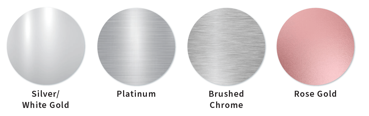
- White Gold: Bright, cool white gold tones perfectly match Bright Winter’s sharp and icy palette.
- Platinum: A sleek, reflective metal that enhances Bright Winter’s high-contrast and cool aesthetic.
- Polished Silver: Opt for bright, shiny silver with a reflective finish to align with Bright Winter’s clarity and vibrancy.
- Polished Finishes: Choose shiny or reflective metals with a crisp finish. Avoid overly matte or antiqued metals, as they can dull Bright Winter’s radiant energy.
Note: Warm-toned or muted metals like yellow gold, rose gold, or tarnished finishes may clash with Bright Winter’s cool, vibrant aesthetic.
Ideal Gemstones for Bright Winter
Bright Winter thrives with gemstones that reflect its high-energy, vibrant, and cool qualities. The best choices include:
- Sapphire: Bright blue sapphires add a rich, vivid contrast that aligns with Bright Winter’s clarity.
- Amethyst: Clear, vibrant purple tones harmonize beautifully with the cool, crisp palette.
- Aquamarine: Icy, luminous aqua tones add a refreshing pop of color that complements the season’s vibrancy.
- Diamond: Clear, sparkling diamonds perfectly embody Bright Winter’s sharp and brilliant energy.
- Emerald: Bright, cool green emeralds enhance the striking contrast and vibrancy of Bright Winter.
- Pearls: Bright white pearls offer a clean and harmonious look that blends seamlessly with the palette.
What to Avoid:
- Warm, Earthy Gemstones: Avoid gemstones like golden topaz, amber, or coral, which can feel too warm for Bright Winter’s cool and crisp aesthetic.
- Dark or Muted Stones: Gemstones like smoky quartz, garnet, or olive jade detract from Bright Winter’s clarity and vibrancy.
- Overly Soft or Pale Colors: Pastel gemstones like pale pink quartz or light peach morganite lack the boldness needed for Bright Winter’s striking aesthetic.
Section 8:Building a Sustainable Bright Winter Wardrobe
Creating a wardrobe that reflects your seasonal palette isn’t just about selecting the right colors—it’s about building a sustainable, timeless collection that enhances your natural beauty while aligning with your Bright Winter palette and reducing waste.
By focusing on quality over quantity, you can create a wardrobe that stands the test of time while showcasing your bold, high-contrast aesthetic.
The Value of Quality
High-quality clothing is an investment in longevity, vibrancy, and style. Well-made pieces:
- Retain their shape and brightness after multiple washes, which is essential for Bright Winter’s crisp and saturated colors.
- Are less likely to pill, fade, or fray, ensuring your wardrobe stays polished and vibrant.
- Provide better fits, enhancing your overall look effortlessly.
While quality items may come with a higher upfront cost, their durability and ability to showcase Bright Winter’s striking tones save money and effort in the long run.
Curating a Sustainable Wardrobe
To build a wardrobe that lasts and reflects Bright Winter’s energy, focus on timeless pieces that align with your palette and lifestyle:
- Start with Neutrals: Invest in staples like a crisp white blouse, charcoal trousers, and a black tailored coat. These pieces provide a versatile base for Bright Winter’s vibrant hues.
- Add Core Colors Strategically: Choose bold and vivid hues like cobalt blue blazers, fuchsia scarves, or icy silver knitwear to complement your neutrals.
- Seasonal Versatility: Opt for adaptable layers, such as sleek cardigans or jewel-toned scarves, to ensure your wardrobe transitions seamlessly between seasons.
Tips for Choosing Quality Pieces
When building a sustainable wardrobe, prioritize the following:
- Natural Fabrics: Choose materials like cotton, silk, lightweight wool, and cashmere. These are durable, breathable, and perfect for showcasing Bright Winter’s vibrant colors.
- Attention to Detail: Look for reinforced seams, high-quality zippers, and lined fabrics to ensure longevity. Bright Winter thrives on polished, clean looks that require well-made pieces.
- Timeless Cuts: Focus on classic designs like structured blazers, tailored trousers, or simple sheath dresses. These styles highlight Bright Winter’s clarity and balance vibrancy with elegance.
Benefits of Minimalism
Fewer, better pieces not only reduce clutter but also simplify your daily styling. A carefully curated wardrobe:
- Amplifies Your Style: Reflects your unique style and Bright Winter’s bold palette, ensuring your outfits always feel cohesive.
- Encourages Mindfulness: Reduces impulse purchases and promotes intentional shopping, helping you choose pieces that truly align with your needs and aesthetic.
- Supports Sustainability: Reduces fashion waste and lowers the environmental impact of your wardrobe by focusing on durable, high-quality items.
By embracing quality, intentionality, and the vibrancy of your Bright Winter palette, you can create a wardrobe that is as striking and dynamic as you are.
Section 9: Bright Winter Before & After
Here are some before and after pictures from the Bright Winter season to draw inspiration from:
(see more before & after pictures)
Conclusion
Bright Winter is a bold and versatile color season, defined by its vibrant, cool tones and striking clarity. The Bright Winter color palette provides endless opportunities for creating dynamic and eye-catching looks. In the following blog posts, you can explore other seasons, such as True Winter, Bright Spring, and Cool Summer, to deepen your understanding of the seasonal color system and how each palette celebrates unique features and characteristics.
Bright Winter Color & Styling Guide